Style & Branding
The chat widget is fully customizable. Settings live in two places:
- Widget → Style — colors, fonts, message bubbles, widget size, fixed links, and footer.
- Widget → Content — bot name, greeting, avatar, language, and branding text.
Every change is shown instantly in the Live Preview on the right, and most settings auto-save as you edit.
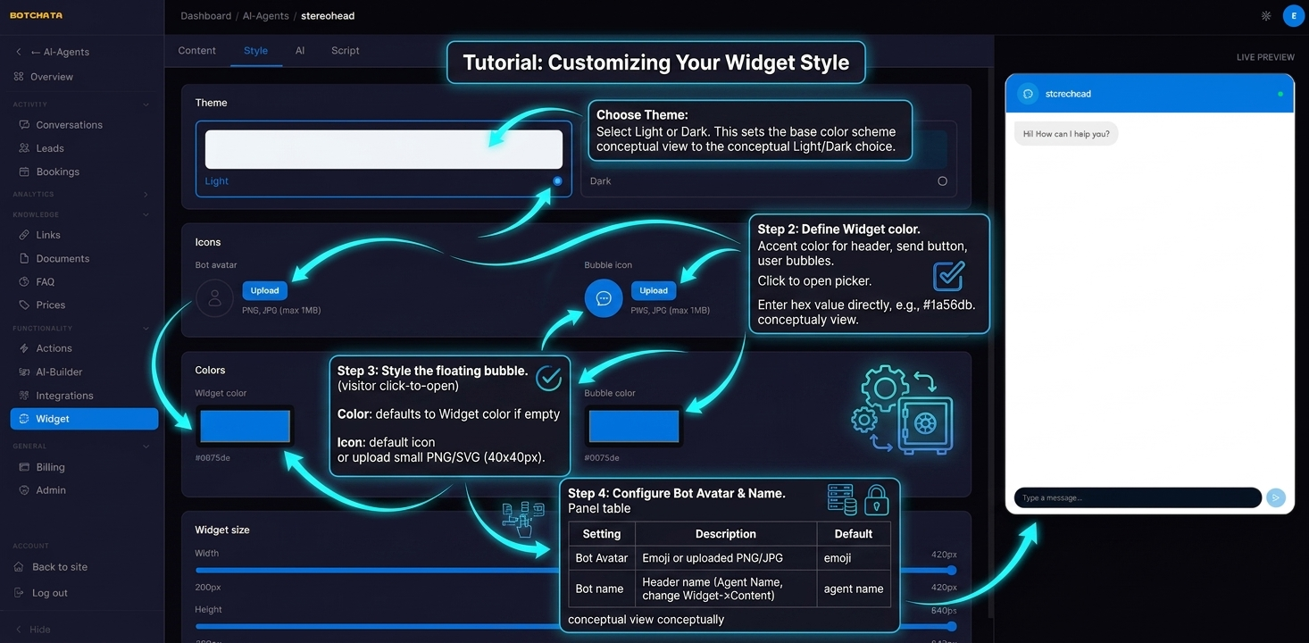
Theme
Choose Light or Dark. This sets the base color scheme for the entire widget — background, text, borders, and input areas.
Choosing Dark doesn't affect your website's own theme — only the widget.
Widget color
The primary accent color used for the header bar, send button, and user message bubbles. Click the color swatch to open the picker, or type a hex value directly — for example #1a56db.
Launcher bubble color and icon
The floating button that visitors click to open the chat.
- Color — defaults to the widget color if not set separately.
- Icon — choose the default chat bubble icon, a custom emoji, or upload a small PNG/SVG image (recommended: 40×40px).
Bot avatar
Shown next to every bot message. Options:
- Emoji — pick any emoji character. Simple and readable at small sizes.
- Image — upload a PNG or JPG. Round-cropped to a circle. Recommended size: 80×80px.
Chat header
In the Style → Chat Header block you can set:
- Tagline — small text under the bot name (e.g. "AI assistant" or the bot's role).
- Name color and Tagline color — override the header text colors.
- Reset tooltip — the label shown on the "New conversation" reset button.
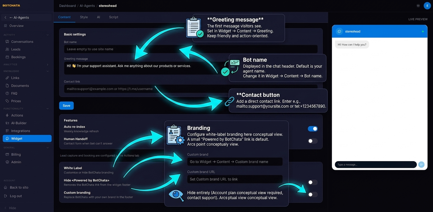
The bot name itself and the greeting message (the first message visitors see) are set in Widget → Content. Keep the greeting friendly and action-oriented:
Hi! 👋 I'm your support assistant. Ask me anything about our products or services.
Message bubbles
In the Style → Messages block:
- Input placeholder — hint text in the message box (default "Type a message…").
- Font size — base font size for the conversation.
- User bubble — background and text color of the visitor's messages (enable Override to set a custom background).
- Bot bubble — background and text color of the bot's replies.
Widget size
In Style → Widget size, drag the sliders to set the chat window dimensions:
- Width — 240 to 520 px
- Height — 360 to 800 px
The size you set here applies to the embedded widget on your site, not just the dashboard preview. On mobile the widget always expands to fill the screen, regardless of these values.
Widget language
By default the widget auto-detects the visitor's language from their browser and localizes all built-in labels (buttons, form fields, placeholders) accordingly. To force a specific language, pick it from the Language dropdown on the Style tab (English, Ukrainian, Polish, German, Spanish, French, Italian).
This controls the widget's interface labels only. The bot always replies in the language the visitor writes in.
Fixed links
In Style → Fixed links you can pin up to 6 links that appear with the bot's answers — handy for a contact page, pricing, or a "Book a demo" call-to-action.
For each link set a Label and a URL (http/https only). You can also control:
- Background / text color / size — match the links to your brand.
- Placement — Under each message (shown beneath every bot answer) or Bottom of chat (a persistent bar above the input).
Custom footer HTML
In Style → Chat Footer you can add your own HTML below the conversation — a disclaimer, a privacy-policy link, or office hours.
For security, only these tags are allowed: <a>, <span>, <strong>, <em>, <b>, <i>, <br>. Links automatically open in a new tab.
The custom footer is available on the Business plan and above.
Branding
By default a small "Powered by BotChata" link appears at the bottom of the widget.
To replace it with your own brand, go to Widget → Content:
- Custom brand name — your company name.
- Custom brand URL — link the brand text to your own site.
To hide the branding entirely, your account needs a plan that includes white-label (Enterprise/Agency). See Plans & Billing.
Contact button
To add a direct contact link inside the widget header, set Widget → Content → Contact URL to mailto:support@yoursite.com or tel:+1234567890. The contact icon appears when this field is set and is hidden when empty.
Voice input
When a visitor's browser supports speech recognition (Chrome, Edge, Safari), a microphone icon appears in the message box automatically — no setup required. The visitor can dictate a message, review the transcript, and edit it before sending. The mic is silently hidden on browsers that don't support it (e.g. Firefox).
The + launcher menu
The widget footer has a single + menu that hosts booking and any forms or widgets you choose to expose. Add an item to it by enabling "Show in widget menu" on a custom form (Custom Forms) or a builder widget (Widget Builder). Booking appears here automatically when it's enabled. The menu is hidden when there's nothing to show.